It seemed to me that as a part of course pre-planning for long ocean races, it might be useful if I published on Solfans for each new SOL ocean race the suggested OpenCPN routing based on Pilot Chart wind data for people to make use of if they so desired. It also seemed that it might be a useful resource for the non-routers out there.
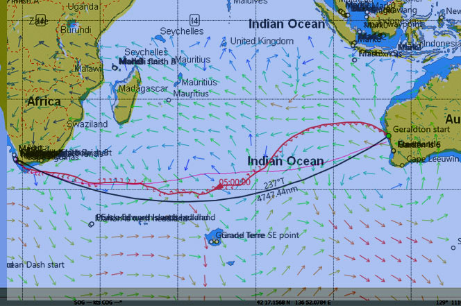
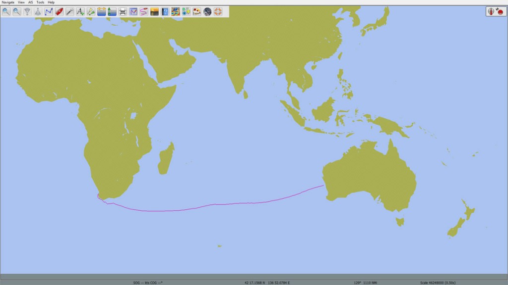
Here is that route for the upcoming Geraldton Cape Town race.
I have run a route on my own router using the SOL grib data and superimposed that for comparative purposes. The suggested Pilot Chart routing for March is the pale pink line and the routing using SOL and NOAA extended grib data as at the 22:30 WX on Feb 28 is the deeper pink line with the wind direction barbs attached. You can see that the primary difference is that the current weather data suggests a much more northerly route than the Pilot Charts suggest, principally because of a significant high currently lying west of Perth.
The OpenCPN Pilot Chart route suggests a trip of 18 days 8 hours, and the route using SOL weather suggests 14 days 13 hours. In other words, we can expect a faster than average trip.
So where did this idea for publishing a pre-race routing based on Pilot Chart data come from? After a couple of years sailing ocean races on SOL, it’s gradually dawned on me that most routers are significantly influenced by the 6 hourly pattern of the low wind/high pressure systems along the length of the course. Those spots of ‘blue goo’, as we term them, bubble around with wildly different locations of winds in the 1-5 knot range at each new WX.
As we approach the ‘goo’ one or two hundred miles away, we know that there will be at least 2-3 WXs before we arrive. We also know that the exact location of the 1-3 knot wind holes will shift around at each WX by distances that can be so far apart across the ocean that we could never change course and cover the distance in time to aim for any ‘bridge’ that might appear at any one WX.
In planning a route, I like to have a good idea of the directions of flow and lateral movement of the major weather systems along the route, in order to position the boat in the most advantageous locations before and upon exiting the ‘goo’ to take advantage of these big systems.
Routers, on the other hand, are not programmed to factor in this circumstance. The data from each WX is the data they work with, and to them, a 4 knot wind is twice the speed of a 2 knot wind and so the location of the 4 knot is a generally a good place to sail towards. It’s not quite as simple as this of course, and in addition, the exact location of the boat at each new WX will also influence their next choice of route, but also so will the new location of the new 4 knot wind zone.
One way around this might be to use a high granularity (eg check wind speed and direction every 24 hours instead of every 3 hours) which could neutralize the significance of the precise locations of the 1-3 knot wind variations. I haven’t experimented with this to any real extent. It has also been noted that the 00:00 and 12:00 WXs contain more detailed data from more observation points, so preferencing that data might be another way of assessing a generally preferred route through the ‘goo’.
However, knowing that Pilot Charts contain historical wind speed and direction data averaged over a long period of time, for different times of the year, it seemed to me that it would be useful to run a route using that data, and see what course it suggested.
Here’s a link to a sample Pilot Chart if anyone is interested. http://msi.nga.mil/MSISiteContent/StaticFiles/NAV_PUBS/APC/Pub109/109jan.pdf
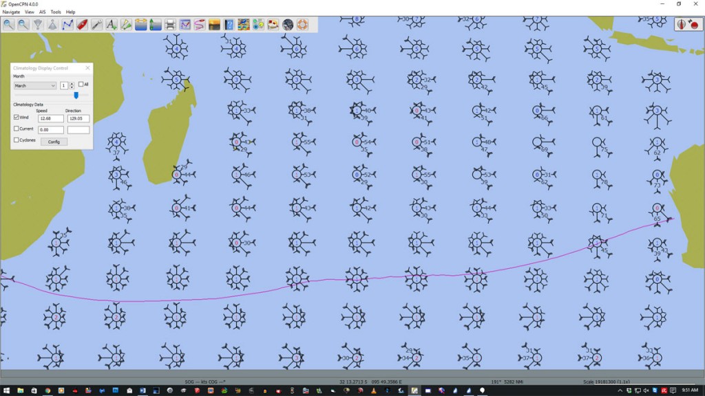
It took me a bit of researching but eventually I found that OpenCPN offered the chance to route using Pilot Chart data. The sample above shows Pilot Chart data within OpenCPN across the Indian Ocean region. The graphic density of the wind roses is set by the software so as not to overcrowd the screen, but the density of the data is much finer than illustrated. Pilot Charts roses I believe hold the wind data at the centre of each 5 degree square, so roughly 300nm apart. OpenCPN appears to have interpolated this data for routing purposes, so can show and use a much tighter grid of wind data.
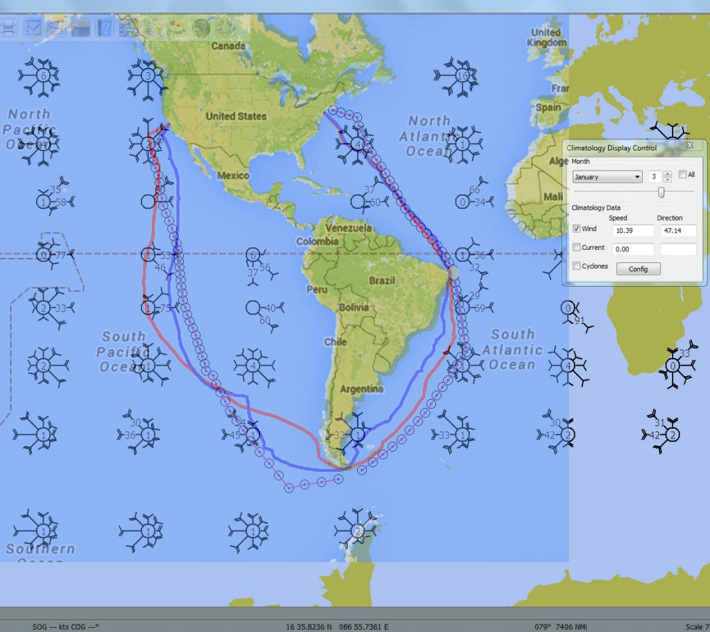
After a bit of fiddling around, I found that I could run a routing at a set time of year and using a particular polar. Out of interest, below is an image which shows the actual courses sailed by Jepsom (red) and Dingo (blue) in the San Francisco New York race superimposed on the OpenCPN routing (pink with dots) based on the Pilot Charts for January. It makes for an interesting comparison.
Of note, those SOLers who headed across to the western coast of Chile/Argentina did indeed arrive at the Cape first, but those who (coincidentally) followed the Pilot Chart course were not far behind. Those like Dingo who went first one way and then the other arrived much later. Also of note, the Pilot Chart course from the Cape to New York went east of The Falklands and stayed out east, as did Jepsom, and NZL_Scotsman.
cheers,
Dingo


Absolutely brilliant!
And, as with most insights, it raises as many questions as it answers.
Next step for me is to try to route using OpenCPN and the Pilot Charts. Love to hear any tips you might have for that endeavor.
But again, absolutely brilliant post! Thank you!
In pre-race planning, there are many inputs to consider. Pilot Charts being what they are (averages of past conditions), there is only a small possibility that a route based on them will be the fastest route. It’s probably more likely if anything to yield a route somewhere in between the fastest and the slowest route taken by the SOLers in any race.
But that said, I just find it interesting to see what comes out of an analysis of historical wind data when placed into a router.
So Bob, I’ll do a short post on OpenCPN routing and Pilot Charts and post it under the Routing Category.
Of interest to note as well, the Pilot Charts winds that I used for this routing and will use in the pre-race Pilot Chart course for future ocean races are not the ‘average’ winds for each Pilot Chart node across the ocean for that time of year, they are the ‘most likely’, which is a very different concept from ‘average’.